STRICTLY

RIDER FIRST RETAIL

GUIDING RIDERS TO INNOVATION STORIES THROUGH ARTFUL MOMENTS THAT AMPLIFY CONCEPTS AND EMBODY BENEFITS.

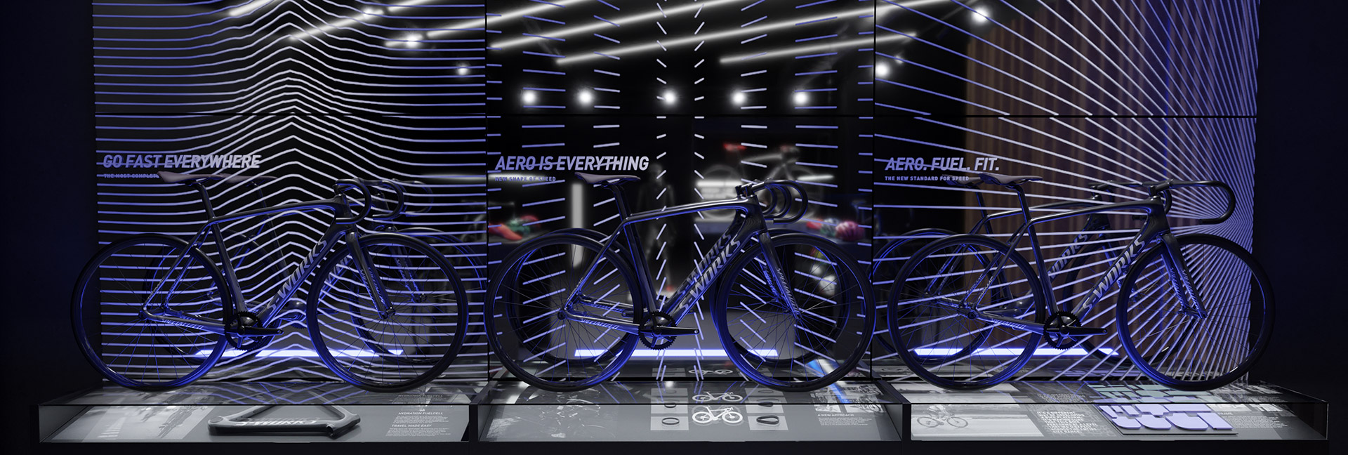
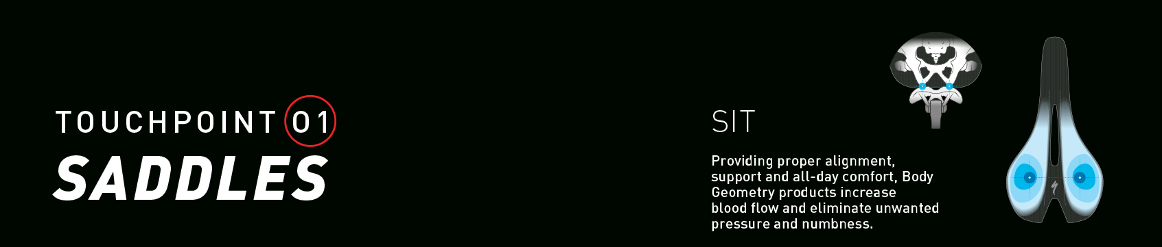
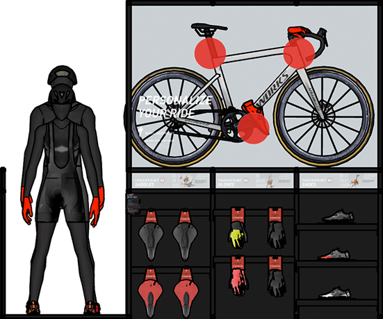
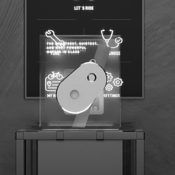
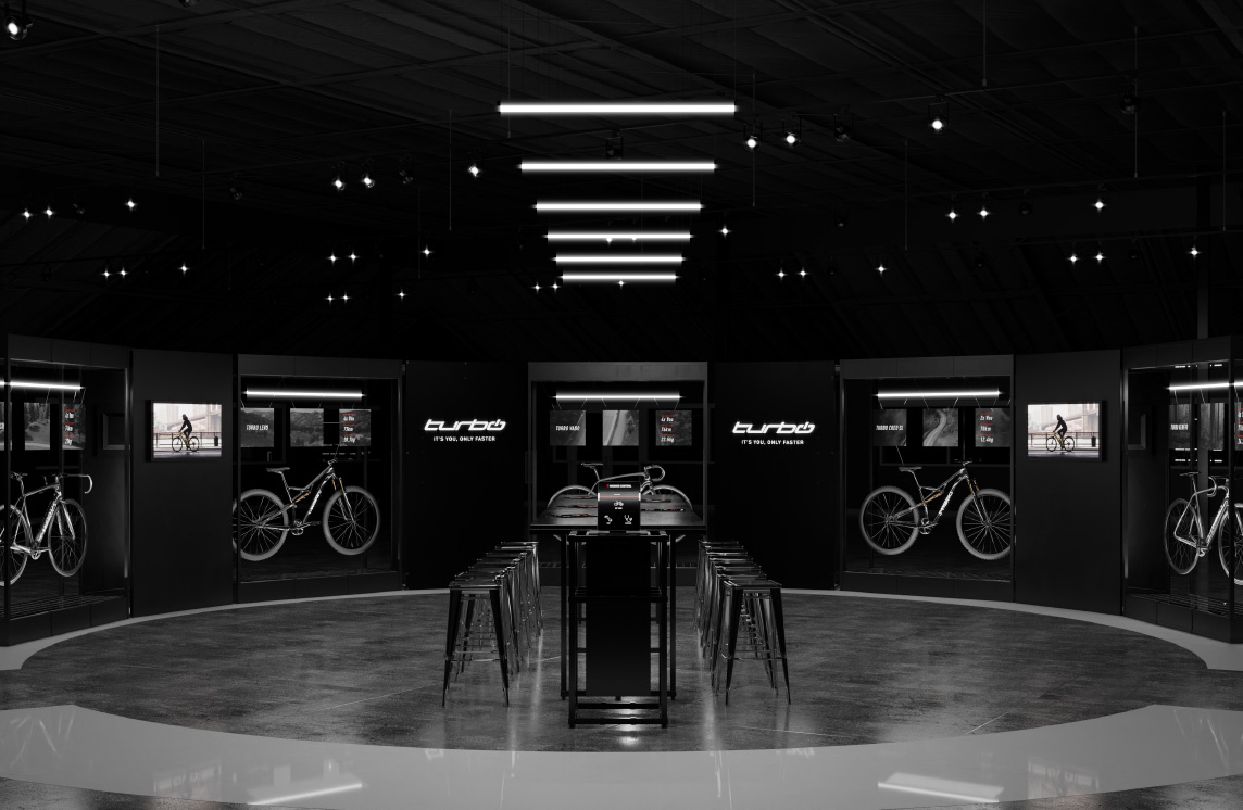
The Specialized story is driven by innovation at every level. So telling that story at each turn stage of the consumer journey is critical to differentiating the brand and validating their core message. However, the world of the traditional retail bike shop is one of density and getting the attention of the consumer takes courage to let go of a small portion of the available space and provide an opportunity to speak to the emotional side of the rider as an access point to in depth innovation stories. Our environmental and brand teams combined their efforts to develop a series of product experiences that elevated a simplified, scaleable and ownable system of elements that the brand could begin to rely on as visual beacons and concept amplifiers to help consumers navigate often overwhelming retail spaces. The result was a series of builds which allowed the Specialized team to drive long-term product storytelling arcs through the investment in product and category platforms that utilized their base fixturing, but allowed for the incorporation of cost effective elements the consumer could begin to associate with each story. While the elements are intended to be used in a variety of configurations, they’re employed with consistency to give the consumer a trusted understanding of the brand’s story over time and a foundation for a lifetime of benefits from the Specialized commitment to the rider.

TRUE TO THE STORY

References to the innovative technologies, research methods and testing process are integrated into the experience in overt and discoverable elements to support the brand’s core truth.

VISUALLY CODED

Effortlessly guiding consumers to the right product quickly and efficiently improves the experience and increase the likelihood of conversion. Graphic elements crafted to amplify the sharp points of each product provide an artful wayfinding element that subtly guides while providing the initial vibe of the product story.

GO FAST ANYWHERE

ALL AROUND

Tied to the biggest need of the all around rider, the Go Fast Everywhere pattern clearly establishes the product’s intent and the stiffer climbing construction that improves performance.

ARO IS EVERYTHING

SPEED FIRST

The wind tunnel testing that accompanies all product development is amplified to capture the spirit of the lightest, fasted bike make by the brand and implies motion even while standing still.

AERO. FUEL. FIT

PURPOSE BUILT

The efficiency of the triathlon discipline is embodied in the Areo. Fuel. Fit. graphic giving athletes a direct connection to their primary need for a product that turns their extreme effort in significant results.

BODY GEOMETRY

Artful clarity aligns the three touchpoints unique to each rider, male or female, with the products that meet the variety of individual needs. By coding the touchpoints on both rider and bike, the consumer is educated on the importance of the ecosystem of products that make up the Body Geometry system and ultimately improve their experience and performance.

TURBO

The E Bike visualized as an effortless catalyst for “Faster” with lighting to capture the power and effort levels and mirrored bases to embody the lightweight ride to counter the slightly increased weight.

GOOD, BETTER, BEST

SCALABILITY

The wind tunnel testing that accompanies all product development is amplified to capture the spirit of the lightest, fasted bike make by the brand and implies motion even while standing still.

GRAPHIC SYSTEMS

Consistency in the messaging and delivery of information is key to providing riders with the information they need quickly and efficiently. The standards allow consumers to process all specialized wayfinding, benefits and details with ease as they navigate and move from product to product.